Saturday, March 13, 2010

TURNING FORM WITH COLOR


In this exercise, we practice, in a very simplified form, turning the form with color. This enables you to conserve values, which can be very useful in creating a unified design. We talked about coming up the color wheel as the form turns into the light.

Friday, March 12, 2010

BOISE RIVER


A classroom demonstration. This scene is, believe it or not, in downtown Boise. The river is in incredibly natural condition, and a trail follows alongside, where you can walk, bicycle, and sometimes even ski. One of the prettiest downtown parks I've ever seen. This was a cold winter day, and I was on a search for some color.

Thursday, March 11, 2010

COLOR FIELDS


4 ways to view and paint color fields; portraits of a section of ceiling at LOAD:

Top left: Match the color mixing with a painting knife and lay it on the canvas in the general area it fills. You can keep it simple as in the example, or narrow the areas down to tiny spots.

Top Right: Fill the whole shape with a color to represent the general color of the field. Then look more closely at the field, and mix next to the original color so you can compare the color, mixing variations of the main color.

Bottom Right: Mix color to approximate the color of an area, and lay it on in dots, lots of dots where it is most prevalent, fewer dots where it is the least. Keep adding dots of color until the overall field approximates the color and variations that you see.

Bottom left: Scan the whole field. Note where a particular rainbow hue predominates and mix a fairly saturated mix of that hue. Grade it across the shape from most to least. Do this with other hues until the shape approaches the appearance and saturation of the observed color.

Wednesday, March 10, 2010

GRUPPE ON COLOR, 3

“If the values are wrong, the best color work in the world could never make the picture look true.”

Can you alter a value pattern? Lots of artists talk about doing it. Or moving a light object in front of a dark object. There may be ways of playing around with values in a realistic landscape, adding shadows here, eliminating shapes there, rearranging things, creating counterchange. I think here, that Gruppe must be talking about the precise relationship of values between distant objects and near ones, and between values within an object, so that the value relationships express a consistent quality of light within a scene.

In my personal experience, there are paintings that when I view them, the value/color relationships look spot-on. That isn’t to say that they are copied from nature (impossible, really, within the color space of paint), but that they are so internally consistent as to leave the impression of reality. Get even one of these relationships a little bit off, in comparison with the others, and the illusion falls apart. Gruppe here is saying that value is the most important relationship, color less important. It seems to me that color is an area where the artist can play a bit.

Tuesday, March 9, 2010

REVIEW: A. T. Hibbard, N. A.: Artist in Two Worlds. By John L. Cooley.

A. T. Hibbard, N. A.: Artist in Two Worlds. By John L. Cooley.
Another art book recommended to me in an artist’s blog. This one is an entertaining biography. My favorite parts are the color plates (I do love color plates) of some Hibbard paintings, and a chapter near the end of some Hibbard wisdom about painting.
“Avoid using Nature photographically. Many adjustments are necessary. They should make the painting more successful as a work of art.”
“Associate with your material, aesthetically as well as physically. It is impossible to do that in a studio.”
“Beware of too much studio landscape painting. Direct contact gives you the rare elements, moods of short duration.”
“Be prepared to change quickly the scheme of the landscape; or if necessary try to remember it.”
“Follow the weather. Know how it affects your painting territory so you can know what will happen to your material at various times of day.”
“The foreground of your picture should be a lead-in to what is beyond.”
“Too much white weakens your sketch. Get color and vibrate it, without overmixing.”
“Focus on a dominant part of your subject, whether sky, distance, middle distance, or foreground.”
“Too high a key in a picture often sacrifices color and strength, and the painting becomes diluted. We must lower Nature’s key which many times is quite beyond the capacity of pigment.”

Monday, March 8, 2010

GRUPPE ON COLOR, 2

“Reserve the lightest lights and darkest darks and bring values together.”

This is one of those bits of advice that you hear now and again, and no one ever explains why. Here’s one explanation that I’ve heard, and even repeated in those moments when I believed it (paraphrased): White has no color information in it. If you want the eye to be stimulated by color, you must put color in your whites. But if that were the case, why would watercolorists be repeatedly advised to save lots of whites, even to the finish of the painting? ??

The trouble with taking advice at face value is that the reasons for the advice get lost. Why would watercolor artists be advised to save whites, while oil painters are advised to get rid of them? One possible reason is the chalky effect that white can have on an oil painting, another subject which deserves some discussion... another time. Also, the white of watercolor paper is seldom a strong white, usually having a little warm off-white color to it.

Darks could be similar: in lending a warm or cool cast to the dark colors, you allow the eye some color information. Watercolors simply aren’t capable of making the strong darks that oils are, although sometimes artists get close. Even so, watercolor darks with no color to them, no warm or cool tendency, have a muddy look to them, and become unappealing pretty quickly.

So maybe the real reason to keep the pure white out of the oil painting and the deepest dark out of the oil and watercolor is that they just don’t look all that good.

What do you think?

Sunday, March 7, 2010

REVIEW Twilight of Painting by R. H. Ives Gammel

I picked up this book (on inter-library loan, as it is out of print) on the recommendation of an artist whose blog I read regularly, hoping to learn more about the traditions of fine art.

Gammel's thesis appears to be that the academic painters of the 19th century (which term he goes to great length to define) and the impressionist painters of the 19th century (which includes anyone not painting in the fine tradition of painting handed down through the ages) had a falling out. The first impressionists, having been themselves trained in the academic tradition, had all of the fine art skills at their disposal and experimented in new techniques by choice. But when they went on to train their successors in (Gammel admits) the fine art of observing from nature and capturing the effects of light, they threw out the baby with the bath water and neglected to teach a full range of the painter's art, including drawing, so that the skills of the academic painter have been lost.

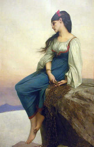
For me, a perplexing part of this book was Gammel's critique of the various art plates in the book, (which are, unfortunately, black and white.) Even allowing for difference in taste, I fail to see why this noodly lady:

http://art-quarter.com/beck/joe/aj/1/3/ingres-odalisque98.jpg

is a better painting than this:

http://artrenewal.org/pages/artwork.php?artworkid=4889


or even than this:

http://farm4.static.flickr.com/3213/2614520891_e557fc2c8d.jpg


It seems to me that most of the paintings he includes in his plates are examples of fine painting in their particular traditions, and only a few exhibit the flaws he claims they do. I would have liked better illustrations and better explanations so that I could have understood his point. If the tradition of fine painting has been lost, he failed to show me that it has.

The book is full of a great deal along this vein, which, now that I've told you, you don't have to read. Certainly, some lively debates could be made for and against many of his points. But ultimately, I think the embedded lesson is "don't neglect your scales," that is, don't neglect studying the basics of drawing and design and understanding value, and the technical manipulation of paint, all of which contribute to great painting in any style.